
These short image processing instructions were written by request of the participants of Theos-trans project.
Image resolution requirements
Resolution requirements for the images which are being prepared for publication. Here I speak about bitmap images only. If there's line art (black and white, 1 bit depth) diagram, as a rule, 600 dpi is enough. A very good reproduction of artistic graving in metal may sometimes require more but these cases are rare. If you print a photo, be it in color or in grey tones, 200�300 dpi is enough, because in the process of print the image undergoes rastering, and the resolution of the image should be not less than that of the printer or phototypesetter, which is measured in lpi (lines per inch) and is several times less than its dpi resolution for line art images.
But it doesn't mean at all that when you scan an image from a book 300 dpi is enough. It's enough for original photographs and paintings, but all printed matter has undergone the screening or rastering process mentioned above. If we try to scan them, moire appeares. To avoid that we should scan them in the highest resolution available, to reproduce all the dots created by typography. Then our image undergoes so called descreening process which is a mathemathical operation to create middle tones from scattered points of black and white. Most of the serious graphic software packages have this option. Then the image may be safely reduced to 300 dpi or so. Watch how rough the original raster was and select appropriate resolution. For some printed images it might be even 100 dpi. (See details below).
Note that the image scanned that way shall never reach the original quality and some loss is inevitable. So if you are in contact with authors or publishers of the original, it would be very desirable to get from them the files scanned from original illustrations.
Image formats. As a rule, TIF or PCX format is used. Some professionals prefer TIF, as having many features, but there are very many subformats of TIF while PCX is more uniform. GIF is not desirable because it may not support original size and resolution values. JPG's are sometimes permissible if they are created with lowest compression, taking into account that during the print we inevitably loose the shades and it is almost impossible to reproduce 24bit image in full quality. Never use JPG for line art images, charts and diagrams!
Hardware
As for scanners, Mustek, Umax and Hewlett-Packard seem to be good enough, though HP is rather for office use than for DTP, nevertheless if properly used it can provide quite satisfactory quality. Scanning software greatly varies with the scanner model used, so I don't describe it here. Suffice to say that some of those programs have their own anti-moire algorithm. Avoid software which doesn't enable you to control dpi, brightness and contrast. Some professional scanners have 32bit color depth, so the quality of resulting 24bit image can be better if we adjust proper brightness when scanning and perform only minor correction afterwards. What type of correction is meant, I'll describe below. Select resolution with care. If you need, for instance, 300 dpi, don't scan at 400 or 500 with subsequent software resizing. Such recalculation will inevitably spoil the quality. Scan at 300 or 600, i.e. avoid fractional numbers in resize ratio. Take care lest the image was slanted. Subsequent software rotation in order to set the image upright, reduces its quality. Nevertheless, there's an exclusion for 90 or 180 degrees; such rotation is safe. Use flatbed scanners, avoid those which suck the paper into themselves like a fax machine. As a rule, they are of lower quality, and they don't enable you to correct angle manually.
Image processing tips
As an image processing software you may use Picture Publisher by Micrografx. It may be not so powerful as Photoshop but it works faster and has less hardware requirements. Even the good professional cannot remember and use all the features of the big packages. The less is the software size, the more space for our data it leaves both in RAM & HDD. Another advantage of Picture Publisher is that it is sometimes supplied for free with the scanners what may be important in those countries where software piracy is strictly persecuted. Adobe products are expensive enough.
I'll try to explain the process using two examples, one of normal color photo (an original on photographic paper) and another of the black and white photo scanned from a book. Combining these two examples you'll understand how to deal with color book illustrations.
This illustration shows how the photograph looked just after scanning. Selecting "Tone balance" option in the "Map" menu of the Picture Publisher, you shall see the histogram. It shows the shades which the image really occupies between two extreme limits � black and white. In the photograph the sheet of paper lying on the table should be obviously white, but it isn't so. Drag by the mouse the right boundary to the left, setting it near the right side of the black area of histogram. It will make brightest areas of the image really bright. Of course, it should be done discriminately, for the image may not contain bright areas. Similarly you may drag the left boundary right, to make darkest areas really black, if necessary. This operation works more accurate and is more convenient than mere brightness and contrast adjustment. The result is shown below.

Nevertheless, if your scanner has greater color depth than 24 bits, as some professional models, it is useful to adjust brightness and contrast during the scanning in order to make the histogram wider (to use more rationally the color depth provided by 24 bit format). If initial contrast is low, the histogram is narrow and stretching it we lose shades (really we initially hadn't enough of them and have nothing to stretch). Anyway, even a very good typography can reproduce less shades than average VGA monitor, so some loss is permissible. But just because of that such correction is needed, to use more fully the poor resources of the typography.
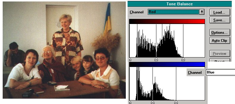
The above described process is good for grayscale photos but not very satisfactory for the color ones. The photograph obviously has some reddish hue, and the white objects aren't really white. This picture was taken by daylight and they should be white. Take care, it is not always so when pictures are taken by the lamp with different color temperature. Though you may correct it if you really need, for sometimes it isn't desirable at all, in order to retain effect of sunset or lamps. So in case of color images if they have obvious color flaws, you shouldn't select "Master" channel, but correct different color channels separately. The three channels, red, green, and blue, all have their own brightness and contrast qualities. A film, a paper, a scanner, all have color distortions of their own, and the error accumulates. You may see on a picture below that the histograms for red and blue channels, before they were corrected, had different breadth and different boundaries. After the similar separate correction of the bright boundary of all three channels the image looks as shown below:
Now the image is ready for publication. I haven't change the dark (left) boundary because it wasn't needed for that image. In some difficult cases the central point also can be moved. For example it is needed when it's desirable to lighten dark shades to make them more distinguishable without spoiling the light shades. The more sophisticated procedure is available through the "Modify color maps" option. After you have adjusted one channel only, the hue becomes wrong. Don't worry and proceed with the others, the result shall be seen only when all channels will be adjusted. The resolution for such color images should be 200-300 dpi. In other words, it shouldn't be less than lpi (lines per each) capacity of phototypesetters, but it is useless to have much more. If you can control the rastering algorithm, you can sacrifice the quantity of shades in order to increase lpi. This tip is sometimes used for the photographs of machines, buildings, etc.
Now we proceed to illustrations scanned from the books. They have undergone process of rastering (screening). They should be scanned with a high resolution in order to reproduce all the features of the raster.

This is a fragment of the photo scanned from the book with 1200 dpi. It depicts a part of the nose of Colonel Olcott. Dividing our dpi (1200) on the distance between the dots of raster (in pixels) we shall get the original lpi. Here it is around 100 or 150. So we cannot hope to extract an image with resolution more than 150 dpi from this source. If we leave it unchanged and try to print or resize it, moire will occur. In color image it can also cause color distortion.

(The same results will ensue if we scan such image with low resolution (around 75-150 dpi) if scanning software is not provided with descreening option.)
So we have to recalculate the image, in order to resolve each raster cell which in our file contains many pixels, to some pixel with average value. It decreases resolution to original lpi or less, but eliminates moire. This operation is called descreening and different software packages have their own algorithms. (Some of them may calculate an average without reduction of dpi, but it shouldn't deceive you � we cannot extract more dpi than original lpi was). But before you have to perform tone adjustment as described above. We see really white paper between the dots, so the bright boundary should be adjusted accordingly. It is a good idea to leave some white area around the image when scanning in order to have a specimen of the paper, which shall look gray, until we adjust. As a rule, dark boundary should be also adjusted, for it is a specimen of black typographic paint. It makes the difference with the original photographs which can have no black areas, and if adjusted, their grey areas would look too black.
After the adjustment we go to the "Image" menu and select "Resize image". The "use smartsizing" option should be on. It means that calculation of the average will be used. You'll see your scanned resolution in the window. Replace it by lesser, corresponding to estimated lpi (around 75�300) and click OK. Then try to use screen resize (PgUp/PgDn) or print to make sure that there's no moire anymore. If it is, you have selected too high resolution. Click "Undo resize" in "Edit" menu and try again with the lesser resolution. Here it is.

You may also try "Remove pattern" option from "Effects" section of
"Image" menu.
Wishing you success, Konstantin Zaitzev
webmaster of Theosophy in Russia project www.theosophy.ru